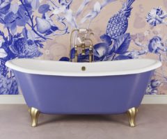
Il blu è il colore dei grandi cambiamenti: mentre il ceruleo era stato eletto colore dell’anno 2000 (vi ricordate l’iconica scena del film Il diavolo veste Prada a proposito di questo colore?), simbolo del volgere del secolo, del futuro e dell’inatteso, quello di quest’anno è definito Classic Blue, ed è un po’ come se il Pantone Color Institute avesse intravisto da uno spioncino quello che il 2020 ci avrebbe riservato, e avesse voluto in qualche modo rassicurarci. Classic Blue è il colore della resilienza; rievocando il cielo all’imbrunire, le qualità rassicuranti di questo colore stimolante mettono in evidenza il desiderio di una base stabile da cui partire mentre ci apprestiamo a varcare la soglia di una nuova era, ma anche mentre andiamo incontro ad un mondo che inevitabilmente sta cambiando. Imprimendosi nella nostra mente come un colore rilassante, PANTONE 19-4052 Classic Blue offre rifugio e infonde nell’animo umano un senso di pace e tranquillità.
Sappiamo bene che il 2020 è ormai alle soglie della sua seconda metà, ma con una tonalità come questa, ideale per il periodo estivo, ci sembrava questo il momento più adatto per parlarne. Il colore dell’anno infatti si adatta benissimo anche alle case estive, specialmente se associato al bianco e ancor di più nel classico abbinamento rigato, ma anche per porte e finestre per dare subito quel tocco di relax in più. E’ perfetto anche per gli sportelli della cucina o per un elegante divano, così come per i tessuti: in veste di tappeto è capace di decorare un angolo mentre come trapunta porta eleganza e charme in camera da letto.

Blue is the color of big changes: while cerulean had been elected the color of the year 2000 (do you remember the iconic scene in the film The devil wears Prada about this color?), symbol of the turn of the century, of the future and the unexpected, this year’s is called Classic Blue, and it’s a little like if the Pantone Color Institute had glimpsed through a peephole what 2020 would have reserved for us, and had somehow wanted to reassure us. Classic Blue is the color of resilience; recalling the sky at dusk, the reassuring qualities of this stimulating color highlight the desire for a stable base from which to start as we prepare to cross the threshold of a new era, but also while we are facing a world that is inevitably changing. Imprinted on our mind as a relaxing color, PANTONE 19-4052 Classic Blue offers refuge and instills in the human soul a sense of peace and tranquility.
We know well that 2020 is on the threshold of its second half, but with a color like this, ideal for the summer, this seemed the most suitable time to talk about it. The color of the year in fact adapts well also to summer homes, especially if associated with white and even more in the classic striped combination, but also for doors and windows to immediately give that extra touch of relaxation. It’s perfect also for the kitchen cabinets or for an elegant couch, as well as for fabrics: as a carpet it’s able to decorate a corner while as a quilt is brings elegance and charm to the bedroom.


All pics: Pinterest